Intro to K-Means
Introduction to K-Means Clustering
Kenny Lov
K-Means clustering is a machine learning algorithm that falls under the category of unsupervised learning. Unsupervised learning techniques are used when there is a set of features without an associated label or response and thus the aim is not for prediction, but rather to uncover new and perhaps interesting trends and subgroups within the data. Unsupervised learning is often used as part of exploratory data analysis and can aid in visualizations. The main goal of K-Means is to partition the observations into distinct groups such that the observations in one group or cluster are as similar to each other as possible while also being as different as possible from the observations from other groups. So, how exactly is similarity measured? By Euclidian distance based on an observation’s numerical features. Here’s a breakdown of the steps of K-Means:
-
Scale the data since Euclidian distances will be involved
-
Select number of clusters believed to exist in the data
-
Randomly initialize the centroids
-
Calculate distances between samples and each centroid
-
Assign the samples into the cluster whose centroid they are closest to
-
Recalculate cluster centers based on these newly assigned samples
-
Repeat from step 4 until cluster centers no longer shift (when samples no longer get reassigned to a different centroid)
Completion of the algorithm yields:
-
A vector of labels that corresponds to which group or cluster an observation belongs to
-
The location in the feature space for each of the cluster centroids
Table of Contents
Applications
Suppose you run an online shopping site and have access to each
shopper’s browsing and purchase histories. A clustering algorithm,
such as K-Means can be used to perform market/customer segmentation by
identifying groups of shoppers with similar browsing and purchase
histories. Once grouped, an individual shopper be shown items that other
similar shoppers have purchased or are interested in, acting as sort of
a basic recommendation system.
Now suppose you’re a breast cancer researcher and you have the results
of gene expression assays from hundreds of patients. You are interested
in which group of genes are associated with the specific type of cancer
you’re studying, so you can use this algorithm to find these subgroups
to gain a better understanding of the disease.
Finally suppose you run an automobile insurance company and want to detect fraudulent claims. You have information about the claims, such as time, location, and number of passengers in the cars involved in the accident. You can perform clustering analysis to attempt to group the legitimate claims together and the fraudulent claims together. Now when you get a new claim, you can see whether this new claim is more similar to the legitimate cluster or the fraudulent cluster.
As you can see, this algorithm can be applied in a wide variety of fields!
The Algorithm
This is the function the algorithm aims to minimize:
Where:
Looks complicated, but all it really means is that we want to divide up the observations into clusters such that the total variation within each cluster is as small as possible. The within cluster distances will be defined with euclidian distance. Therefore the total within cluster variation is defined by within cluster distances divided by the number of observations per cluster .
First, let’s used a contrived toy example to better understand this topic. k-means clustering works better if the clusters are spherical and normally distributed. For this example, we’ll create a small, arbitrary dataset with 5 different clusters (5 populations with different means and variances).
# first create individual clusters with different distribution parameters
set.seed(123) # setting a seed for reproducibility

x1 <- rnorm(50, mean = 5, sd = 1)
y1 <- rnorm(50, mean = 10, sd = 1)
df1 <- data.frame(x = x1, y = y1, label = 1)

x2 <- rnorm(50, mean = 1.5, sd = 1.5)
y2 <- rnorm(50, mean = 3, sd = 1)
df2 <- data.frame(x = x2, y = y2, label = 2)

x3 <- rnorm(50, mean = 10, sd = 0.5)
y3 <- rnorm(50, mean = 5, sd = 2)
df3 <- data.frame(x = x3, y = y3, label = 3)

combined <- rbind(df1, df2, df3)
combined$label <- as.factor(combined$label) # label must be converted into a factor since it will be interpreted as a continuous variable, which it is not.
Now that we’ve created this toy dataset, let’s visualize it and confirm that we’ve indeed created distinct clusters.
library(ggplot2)
th <- theme_linedraw() # setting the theme for the plots
tiff('./images/plot1.tiff', units="in", width=5, height=3, res=300)

ggplot(combined, aes(x= x, y = y)) +
  geom_point(aes(color=label), size = 2) +
  labs(title = "Our Example") +
  th + theme(aspect.ratio = 0.8)

garb <- dev.off()

Yes, there are indeed distinct clusters with various normal
distributions! R already comes with a great built-in function kmeans
that can compute clusters. However, for the sake of understanding, we’ll
hand-code a function that can compute the clusters as well as keep track
of the data for each iteration to visualize the progress of the
algorithm. If this sounds confusing now, it will make sense in a
bit.
my_kmeans <- function(df, n_clusters){ # the function will take a dataframe and num clusters as input
  # first, get the range of possible values to initiate random centers

  Z_hist <- data.frame()          # create history of Z and centers to see progress of iterations
  C_hist <- data.frame()

  Z <- rep(-1, nrow(df))     # Z are our indicator variable, we need to set placeholders for these variables that are different values. values don't matter as long as they are different from each other

   Z_new <- rep(0, nrow(df))  # these variables will tell the algorithm when to stop iterations

  centers <- array(0, dim = c(n_clusters, ncol(df)) ) # create a placeholder for centers array
  # now we can initialize random centers

  min <- min(df)
  max <- max(df)
  for(row in seq(1, n_clusters)){
    for(col in seq(1, dim(centers)[2] ))
      centers[row, col] <- runif(1, min, max)
  }

  # now that we have the centers, we need to find differences between each point from each cluster
  # we will create a distance matrix

  Dist <- array(0, dim = c(nrow(df), n_clusters ) )

  iteration = 0 # keep track of iterations
  while(sum(Z-Z_new) !=0 ){ # keep iterating until Z and Z_new are equal

    Z_add <- data.frame(Z = Z_new, iteration = iteration)
    C_add <- data.frame(centers, iteration = iteration)

    Z_hist <- rbind(Z_hist, Z_add) # appending new iterations to keep track of the history
    C_hist <- rbind(C_hist, C_add)

    Z <- Z_new
    for(center in seq(1, nrow(centers))){
      distance <- apply(df, 1, function(x) sum((x - centers[center, ])^2) ) # compute euclidian distance
      for(x in seq(1, length(distance))){
        Dist[x, center] <- distance[x] # filling in distance matrix with euclidian distances
      }
    }

    Z_new <- max.col(-Dist) # note that max.col function finds the column that has the maximum value.
                            # since we want to find the minimum distance, we invert by distance matrix
                            # by multiplying the whole matrix by -1.

    # next, we need to move the centers since the center values for each cluster has changed

    for(center in seq(1, n_clusters)){
      for(var in seq(1, ncol(centers) )){
        if(sum(Z_new==center) ==0 ) centers[center, var] = centers[center, var]
        else centers[center, var] <- mean(df[Z_new == center, var])
      }
    }

    iteration = iteration + 1
  }
  # cat('Took', iteration - 1, 'iterations to converge!')
  Z_hist$prediction <- as.factor(Z_hist$Z)
  Z_new <- as.factor(Z_new)
  output <- list(Z_new, centers, Z_hist, C_hist)
  return(output)
}
Might not be the most efficient code possible with all the for loops and what not… but let’s see what it can do.
Since this is an iterative approach, we can visualize the progress at every iteration using the history variables provided by my function!
library(gganimate)

no_labs = combined[,1:2]

prediction <- my_kmeans(no_labs, 3)
Z_hist <- cbind(combined, prediction[[3]])
c_hist <- prediction[[4]]

g <- ggplot(Z_hist, aes(x = x, y = y)) +
  geom_point(aes(color = prediction, shape = label), size = 1) +
  geom_point(data = c_hist, aes(x = X1, y = X2), size = 2) +
  labs(title = 'Iteration: {frame_time}') +
  th + theme(text = element_text(size = 5)) +
  transition_time(iteration)

animate(g, nframes=  length(unique(Z_hist$iteration)), fps = 1,
        width = 1000, height=800, res = 300)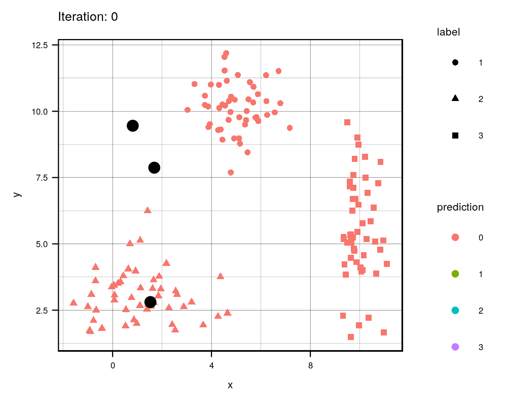
This animation essentially shows each step the algorithm takes to make its decision of which points are closest to each centroid. Iteration 0 is the initial randomization of the centroids (black dots). As you can see, the centroids move around the grid and each color represents which centroid/cluster the individual samples are currently part of. The shape of each point represents the real group the point came from. We can see that the algorithm does a really good job in finding the centers for each group that we manually created, although there are some that are wrongly grouped.
Final Result (as a sanity check, let’s compare with R’s built in
kmeans
function):
combined$predicted <- as.factor(prediction[[1]]) # remeber to convert the integer values to  factors
centers <- prediction[[2]]

kmeans <- kmeans(no_labs, 3)

combined$kmeans_pred <- as.factor(kmeans$cluster)

g1 <- ggplot(combined, aes(x = x, y = y)) +
  geom_point(aes(color = predicted, shape = label), size = 2) +
  geom_point(data = data.frame(centers), aes(X1, X2), size = 3) +
  labs(title = 'My K-means Prediction') +
  th + theme(aspect.ratio = 0.9)

g2 <- ggplot(combined, aes(x=x , y = y)) +
  geom_point(aes(color = kmeans_pred, shape = label), size = 2) +
  geom_point(data = data.frame(data.frame(kmeans$centers)), aes(x, y), size = 3) +
  labs(title = "R's K-means Prediction") +
  th + theme(aspect.ratio = 0.9)

library(gridExtra) # import library to display graphs in a grid

tiff('./images/plot2.tiff', units="in", width=10, height=5, res=600)

grid.arrange(g1, g2, nrow=1, respect=TRUE)

garb <- dev.off()

The difference in colors between the two graphs is simply an artifact of
the random initialization of the centroids. Even though some clusters
are different colors, the points are actually clustered the same in both
my_kmeans and R’s kmeans. So it works!
Now let’s compare the centers that the algorithm found to the actual centers that we created.
predicted_centers <- tail(c_hist, 3)[,-3] # k-means predicted centers
predicted_centers$real <- 'predicted'

real_centers <- matrix(c(5,10,1.5,3,10,5), byrow = TRUE, ncol=2) # generated data from these centers
real_centers <- data.frame(real_centers)
real_centers$real <- 'real'

both_centers <- rbind(predicted_centers, real_centers)

tiff('./images/plot3.tiff', units="in", width=5, height=3, res=300)

ggplot(combined, aes(x = x, y = y)) +
  geom_point(aes(color = label)) +
  geom_point(data = both_centers, aes(x= X1,y= X2, shape = real), size = 3) +
  labs(title = 'Comparing Real and Predicted Centers') +
  th + theme(aspect.ratio = 0.8)

garb <- dev.off()

Although the predicted cluster centers are not perfectly on top of the real centers (due to the random nature of the sampling), they are very close to each other, demonstrating that the algorithm does work when there are distinct clusters!
Since in this case our labels are known, we can caclulate the confusion matrix for the prediction of this algorithm.
Selecting K
Now… you might be wondering how do I determine the number of clusters?! Well, there are multiple ways of doing so. In our case, we decided on three clusters because we knew ahead of time that there would be three clustered, since we generated the data. Here are some ways I can think of:
- Domain knowledge. Ideally, you should be familiar with the data you’re working with and should have a sense of the number of clusters in your data.
- Create a scree plot. Plot the number of clusters against the total within sum of squares distance of each point from its respective centroid. Let’s see an example of this.
# first create function to determine total distance from clusters
# pass in the data (raw data), the predicted labels from k means, and the centers
find_distances <- function(data, predicted_labs, centers){
# first prepare dataframes for computations
merged <- cbind(data, center = predicted_labs) # combining the raw data with the predicted labs
# center_lab <- data.frame(centers, center = 1:nrow(centers))
#merged2 <- merge(merged1, center_lab)
tot_sq_dist <- 0 # initialize total square distacnce
# following lines add up the total squared distances
for(cen in 1:nrow(centers)){
cluster_points <- merged[merged$center==cen, colnames(merged) != 'center']
if(nrow(cluster_points)!=0){
expand_centers <- matrix(rep(centers[cen,], nrow(cluster_points)), ncol = 2, byrow=TRUE)
sq_dist <- sum((cluster_points - expand_centers)^2)
tot_sq_dist <- tot_sq_dist + sq_dist
}
}
return(tot_sq_dist)
}
# testing function ...
# km <- my_kmeans(no_labs, 4)
# predicted_labs <- km[[1]]
# centers <- km[[2]]
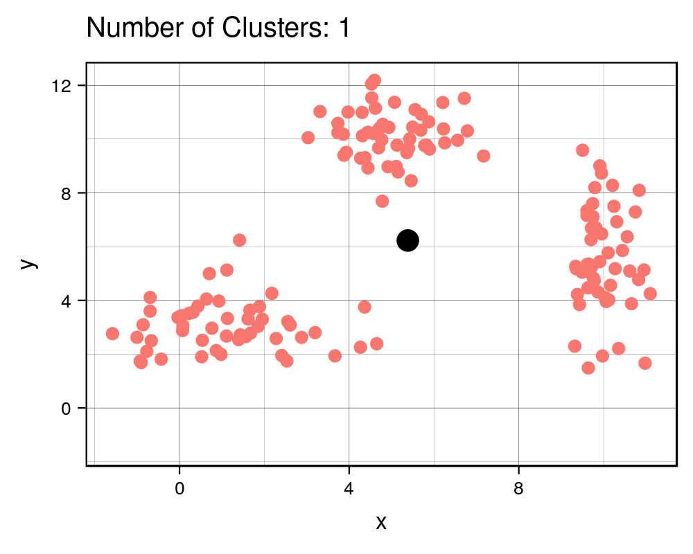
# find_distances(no_labs, predicted_labs, centers)Great, now let’s see how we can use a scree plot to our advantage!
lab_hist <- data.frame() # initialize histories
cen_hist <- data.frame()
dist_hist <- data.frame()

num_clusters <- 10
for(clusters in 1:num_clusters){
  km <- my_kmeans(no_labs, n_clusters = clusters)

  new_df <- no_labs
  new_df$pred <- km[[1]]
  new_df$num_clusters <- clusters

  centers <- data.frame(km[[2]])
  centers$num_clusters <- clusters

  lab_hist <- rbind(lab_hist, new_df)
  cen_hist <- rbind(cen_hist, centers)

  sq_dist <- find_distances(no_labs, new_df$pred,
                                    as.matrix(centers[,colnames(centers) != 'num_clusters']))
  sq_dist_df <- data.frame(sq_dist, num_clusters = clusters)
  dist_hist <- rbind(dist_hist, sq_dist_df)
}

tiff('./images/scree.tiff', units="px", width=1000, height=800, res=300)

ggplot(dist_hist, aes(x = num_clusters, y = sq_dist)) +
  geom_point(size=3) +
  geom_point(color = 'white', size = 2) +
  geom_line(color = 'maroon', size= 0.5) +
  xlab('Number of Clusters') + ylab('Total Squared Distance') +
  scale_x_continuous(breaks = 0:num_clusters+1) + theme_classic() +
  annotate("text", x = 4.5, y = 1500, label = "Elbow Point", size = 3, fontface=2,
           colour = '#4285f4') +
  geom_segment(aes(x=4.2, y=1300, xend = 3.1, yend = 500), arrow = arrow(length=unit(0.3, 'cm')),
               colour = '#4285f4')

garb <- dev.off()

# create the gif
g <- ggplot(lab_hist, aes(x,y)) +
  geom_point(aes(color = pred)) +
  geom_point(data = cen_hist, aes(X1, X2), size=3) +
  labs(title = 'Number of Clusters: {frame_time}') +
  th + theme(text = element_text(size = 8), legend.position = 'none') +
  transition_time(num_clusters)

animate(g, nframes =  num_clusters, fps = 1,
width = 1000, height=800, res = 300)| Cluster # Effect on Sq. Dist | Scree Plot |
|---|---|
 |

|
It is expected that the more clusters there are, the lower the total squared distance will be. However, we can see that there is a steep drop in the total squared distance from 1 cluster to 3 clusters and then marginal reduction in total squared distance upon adding any more clusters, which creates an “L” shaped plot. The number of clusters at the point of the elbow should correspond to the appropriate number of clusters to be used, and in this case it correctly corresponds to our three clusters that we generated. If we take a look at the animation, we see that the algorithm forces the observations into a cluster, even if a true cluster doesn’t actually exist.
Important Note:
It is important to scale or normalize the data before running K-Means
algorithm if the features have different units. Let me demonstrate why
this is so. Here is a contrived example of height and weights along with
gender that I obtained from the web. We have height in mm and weight
in tons (for the sake of demonstration). We know beforehand that there
are two groups - males and females, so we’ll set number of clusters to
2.
library(knitr)
library(kableExtra)
set.seed(123)
h_w <- read.csv('./data/gender-height-weight.csv')[,c(1,4:5)]
colnames(h_w) = c('Gender', 'Height', 'Weight')
# sample observations, since harder to see with 10000 observations
h_w_sample <- h_w[sample(1:nrow(h_w), 200),]
# converting inches to feet for sake of demonstration
h_w_sample$Height = h_w_sample$Height*10
h_w_sample$Weight <- h_w_sample$Weight * 0.0011
h_w_sample$kmean_lab <- as.factor(kmeans(h_w_sample[,2:3], 2)$cluster)

h_w_scaled <- data.frame(scale(h_w_sample[2:3]))
h_w_scaled$Gender <- h_w_sample$Gender
h_w_scaled$kmean_lab <- as.factor(kmeans(h_w_scaled[,1:2], 2)$cluster)

g1 <- ggplot(h_w_sample, aes(x = Weight, y = Height)) +
        geom_point(aes(color = Gender, shape = kmean_lab), size = 4) +
        labs(title = "Unscaled Features") + th

g2 <- ggplot(h_w_scaled, aes(x = Weight, y = Height)) +
        geom_point(aes(color = Gender, shape = kmean_lab), size = 4) +
        labs(title = "Scaled Features" ) + th

tiff('./images/scaling.tiff', units="in", width=10, height=5, res=600)

grid.arrange(g1, g2, nrow=1, respect=TRUE)

garb <- dev.off()

cm1 <- table(h_w_sample$Gender, h_w_sample$kmean_lab)
cm2 <- table(h_w_scaled$Gender, h_w_scaled$kmean_lab)
t1 <- kable(cm1, align = 'clc',
            caption = "Unscaled Features",
            format = "html") %>% kable_styling(full_width = F, position = "float_left")
t2 <- kable(cm2, align = 'clc',
            caption = "Scaled Features",
            format = "html") %>% kable_styling(full_width = F, position = "right")
Confusion Matrix
|
1 |
2 |
|
|---|---|---|
|
Female |
82 |
15 |
|
Male |
17 |
86 |
|
1 |
2 |
|
|---|---|---|
|
Female |
88 |
9 |
|
Male |
11 |
92 |

Now, since this is a boring example, let’s use a more interesting dataset!
Example
This dataset, provided by the ISLR library is called Default. It
consists of four variables: default, student, balance, and
income. Let’s see how well K-Means can cluster these observations.
First let’s see if the algorithm can distinguish between student and non
students.
library(ISLR) # load the library
default <- Default # grab the data

default$kmeans <- as.factor(kmeans(default[,c('balance', 'income')], centers = 2)$cluster)

g1 <- ggplot(default, aes(x=balance, y = income)) +
  geom_point(aes(color = student), alpha = 0.4 )

g2 <- ggplot(default, aes(x=balance, y = income)) +
  geom_point(aes(color = kmeans), alpha = 0.4 )

tiff('./images/example1.tiff', units="in", width=10, height=5, res=600)

grid.arrange(g1, g2, nrow=1, respect=TRUE)

garb <- dev.off()

Looks like it does a fairly decent job distinguishing between students
and non students. It sees that there’s a group that has a lower income
(student) and another group that has a higher income (non students).
Now let’s see if the algorithm can distinguish between students who default, students who don’t default, non students who default, and non students who don’t default.
default$default <- ifelse(default$default == 'No', 'n', 'd') # rename some variables
default$student <- ifelse(default$student == 'No', 'n', 's')
default$group <- as.factor(paste(default$student, default$default, sep = ', ')) # create a new variable group

default$kmeans <- as.factor(kmeans(default[,c('balance', 'income')], centers = 4)$cluster)


g1 <- ggplot(default, aes(x=balance, y = income)) +
  geom_point(aes(color = group), alpha = 0.4 )

g2 <- ggplot(default, aes(x=balance, y = income)) +
  geom_point(aes(color = kmeans), alpha = 0.4 )


tiff('./images/example2.tiff', units="in", width=10, height=5, res=600)

grid.arrange(g1, g2, nrow=1, respect=TRUE)

garb <- dev.off()

Looking at this plot, we can definitely see the general location of some groups. We see that in general people tend to default when their balance is higher and that students have lower incomes than non students. But… that doesn’t look right! Want to guess what went wrong here? The scaling is off! Let’s fix this.
default_scaled <- default
default_scaled[, c('balance', 'income')] <- scale(default[,c('balance', 'income')])

default_scaled$kmeans <- as.factor(kmeans(default_scaled[,c('balance', 'income')], centers = 4, nstart = 100)$cluster)
## Warning: Quick-TRANSfer stage steps exceeded maximum (= 500000)g2 <- ggplot(default_scaled, aes(x=balance, y = income)) +
geom_point(aes(color = kmeans), alpha = 0.4 )
tiff('./images/example3.tiff', units="in", width=10, height=5, res=600)
grid.arrange(g1, g2, nrow=1, respect=TRUE)
garb <- dev.off()

Goes to show how important scaling is. Looks better than before, however, it still doesn’t look right. I didn’t expect this at all but I’m assuming the problem with kmeans is that there is an imbalance of classes. The centroids aren’t where they should be. I guess we learn something new everyday! Well, I’m not giving up yet, so let’s try to fix this problem. I’m going to try oversampling the minority classes and see if that will affect the centroid locations.
# grab the indexes of these categories to oversample
nn_idx <- which(default$default == 'n' & default$student == 'n')
sn_idx <- which(default$default == 'n' & default$student == 's')
nd_idx <- which(default$default == 'd' & default$student == 'n')
sd_idx <- which(default$default == 'd' & default$student == 's')

# oversample each class so that there is an equal number of each one (the majority class)
amount <- length(nn_idx)

sn_idx_over <- sample(sn_idx, amount, replace = TRUE)
nd_idx_over <- sample(nd_idx, amount, replace = TRUE)
sd_idx_over <- sample(sd_idx, amount, replace = TRUE)

new_idx <- c(nn_idx, sn_idx_over, nd_idx_over, sd_idx_over)

default_scaled_over <- default_scaled[new_idx,]
default_scaled_over$kmeans <- as.factor(kmeans(default_scaled_over[,c('balance', 'income')], centers = 4, nstart = 100)$cluster)


g2 <- ggplot(default_scaled_over, aes(x=balance, y = income)) +
  geom_point(aes(color = kmeans), alpha = 0.5)

tiff('./images/example4.tiff', units="in", width=10, height=5, res=600)

grid.arrange(g1, g2, nrow=1, respect=TRUE)

garb <- dev.off()

Well, it looks like the cluster centers have shifted a bit but these groups, based on these features, may not be distinguishable by the algorithm. This goes to show that kmeans doesn’t perform very well in cases where the true groups aren’t spherical and if there are unevenly sized clusters.