Intro to PCA
Introduction to Principal Component Analysis
Kenny Lov
Ever been in a situation where you had to analyze a dataset with way too many variables? Perhaps you wanted to somehow plot your data in a 2-D or 3-D graph while preserving as much information as possible? Was there also high correlation and thus information redundancy among those variables? If you answered yes to all of these questions, then Principal Components Analysis is be a powerful dimensionality reduction tool that should be in your arsenal!
Quick overview of the technique:
-
Center the dataset that has observations and variables (also scale features if necessary)
-
Compute the sample covariance matrix of ,
-
Diagonalize the sample covariance matrix such that it has the form , where is an orthogonal matrix consisting of and is a diagonal matrix such that Diag() , where each is an eigenvector of that corresponds to its eigenvalue
-
Decide the number of principal components to use (), such that , and set
-
Transform the original vectors to by projecting onto the lower dimensional linear subspace spanned by the eigenvectors by computing
-
The columns of will be referred to as the principal components and have the nice property of orthogonality. Each principal component is a linear combination of the original features: where each is a loading (component of th eigenvector) for the corresponding principal component.
Table of Contents
The Algorithm
The steps listed above may seem daunting at first, but it is rather straightforward. Let’s get started with some generated sample data. Although this technique applies to higher dimensional data, it is easier to visualize what is happening with a simple 2D example and project it onto a 1D subspace (essentially onto a line).
set.seed(123) # set seed for reproducibility

# create data that is moderately correlated
x <- rnorm(50, mean = 5, sd = 1)
y <- x + rnorm(50, mean = 0, sd = 1)
X <- data.frame(x = x, y = y)
Now let’s visualize the data :
library(ggplot2)
th <- theme_linedraw() # setting the theme for the plots
tiff('./images/plot1.tiff', units="in", width=5, height=3, res=300)

ggplot(X, aes(x= x, y = y)) +
  geom_point(size = 1.5, color = 'steelblue') +
  labs(title = "Our Example") +
  th + theme(aspect.ratio = 0.8)

garb <- dev.off()

Great, now we will center the data by subtracting the mean of each feature and compute the sample covariance matrix .
X_cent <- scale(X, center = TRUE, scale = TRUE)
Q = var(X_cent)

t1 <- kable(Q, align = 'clc',
            caption = "Covariance Matrix",
format = "html") %>% kable_styling(full_width = F)|
x |
y |
|
|---|---|---|
|
x |
1.0000000 |
0.7025812 |
|
y |
0.7025812 |
1.0000000 |
Now, we will diagonalize the sample covariance matrix such that it has the form via spectral decomposition.
In R this is done using the eigen function, which returns a list of
eigenvalues and the corresponding eigenvectors of the provided matrix.
eig <- eigen(Q)
D <- diag(eig$values)
P <- eig$vectors # Q = PDP^T

# project X onto the eigen subspace
Z <- as.matrix(X_cent) %*% P
This is the graph we get once we project the data onto the linear subspace spanned by the first two eigenvectors.
library(gridExtra)
Z_df <- data.frame(x = Z[,1], y = Z[,2])
g1 <- ggplot(Z_df , aes(x= x, y = y)) +
  geom_point(size = 1.5, color = 'steelblue') +
  labs(title = "Principal Components") + ylim(-2,2) + labs(x = 'PC1', y = 'PC2') +
  th + theme(aspect.ratio = 0.8)

X_cent_df <- data.frame(X_cent)
g2 <- ggplot(X_cent_df, aes(x= x, y = y)) +
  geom_point(size = 1.5, color = 'steelblue') +
  labs(title = "Centered X") +
  th + theme(aspect.ratio = 0.8)

tiff('./images/plot2.tiff', units="in", width=10, height=5, res=600)
grid.arrange(g2, g1, nrow=1, respect=TRUE)
garb <- dev.off()

Very interesting results, huh? If you look carefully, you’ll notice something really cool. What would happen if you were to rotate the centered clockwise just a bit…?
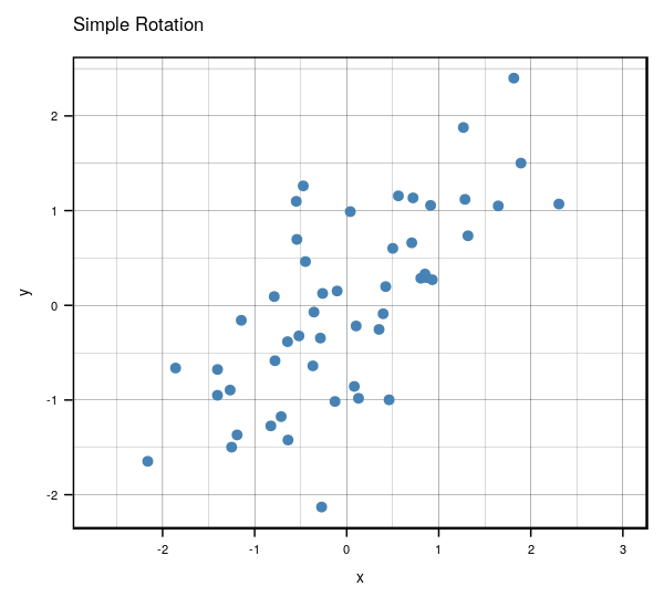
Anyways, that’s what essentially happens if you use the same number of eigenvectors () as there are features in the original data. It becomes a matrix that encodes a rotation operator. It changes the basis of from the standard basis to an eigenbasis. Cool stuff, but if you want to actually reduce the dimensions of your data, you will want to use a , so in this case let’s make such that . To visualize what will happen, let’s plot the subspace that is spanned by the first eigenvector (indicated by the red line). Keep in mind that this is the direction of the highest variance in the data.
tiff('./images/plot3.tiff', units="in", width=5, height=5, res=100)
plot(X_cent_df, pty = 's', pch = 19, col = '#4682b4')
title("Centered X")
abline(a = 0, b =  P[2,1] / P[1,1], col = 'red', lwd = 3)
garb <- dev.off()

Now you might be thinking… this looks quite similar to a simple linear regression right? Wrong! OLS regression aims to find parameters minimize the sum of squares of the errors while PCA aims to find the best surface to project the data onto such that the orthogonal projection error is minimized. Here’s a diagram of what I mean:
ols.segment.coord <- function(x0, y0, lm.mod){
 #finds endpoint for a perpendicular segment from the point (x0,y0) to the line
 # defined by lm.mod as y=a+b*x
  a <- coef(lm.mod)[1] #intercept
  b <- coef(lm.mod)[2] #slope
  x1 <- x0
  y1 <- a + b*x1
  list(x0=x0, y0=y0, x1=x1, y1=y1)
}

perp.segment.coord <- function(x0, y0){
 #finds endpoint for a perpendicular segment from the point (x0,y0) to the line
 # defined by lm.mod as y=a+b*x
  a <- 0 #intercept
  b <- P[2,1] / P[1,1] #slope
  x1 <- (x0+b*y0-a*b)/(1+b^2)
  y1 <- a + b*x1
  list(x0=x0, y0=y0, x1=x1, y1=y1)
}

tiff('./images/plot4.tiff', units="in", width=10, height=5, res=600)

par(mfrow=c(1,2)) # display 2 plots, one row two columns

plot(X_cent_df, pty = 's', pch = 19, col = '#4682b4')
title("Centered X (OLS)")
abline(lm(y~x, X_cent_df), col = 'red', lwd = 3)
ss <- ols.segment.coord(X_cent_df$x, X_cent_df$y, lm(y~x, X_cent_df))
do.call(segments, c(ss, list(col = 'red', lwd = 1, lty = 2)))

plot(X_cent_df, pty = 's', pch = 19, col = '#4682b4')
title("Centered X (PC)")
abline(a = 0, b =  P[2,1] / P[1,1], col = 'red', lwd = 3)
ss <- perp.segment.coord(X_cent_df$x, X_cent_df$y)
do.call(segments, c(ss, list(col = 'red', lwd = 1, lty = 2)))

garb <- dev.off()

As you can see, OLS minimizes errors from while PCA seeks to minimize the orthogonal variance. So what happens to the data once we project it onto the line? Well, it will look like this:
P_k <- P[,1] # select the first eigenvector (2x1)
y <- X_cent %*% P_k # the first principal component is now in shape (nx1)
y_df <- data.frame(x=y, y = rep(0, length(y)))

tiff('./images/plot5.tiff', units="in", width=5, height=3, res=300)
ggplot(y_df, aes(x=x, y=y)) +
  geom_point(size = 2, color = 'steelblue', alpha=0.5) +
  labs(title = 'Projection onto PC1', x = 'First Principal Component') +
  theme_classic() +
  theme(aspect.ratio = 0.8, axis.ticks.y = element_blank(), axis.text.y=element_blank(), axis.title.y=element_blank())
garb <- dev.off()

This can be seen as a lower dimensional representation of the data. We have projected the data onto the axis of maximal variance.
Selecting Number of Principal Components
In the case of higher dimensions, you might be wondering, how would I
select the number of principal components to use? That would depend on
your use case. For example, exploratory data analysis. The most common
application of PCA is for visualization, hence it seems reasonable to
project higher dimensional data onto 2 or 3 dimensions, allowing for a
geometric representation that hopefully captures most of the variation
in the data.
Additionally, it is possible to use this
unsupervised learning technique in the context of supervised learning.
If the goal is to build a predictive model, the principal components can
be used as the features for the model in place of the original features.
Ideally, we would use as few components as possible to adequately
summarize the data. Although there isn’t a steadfast rule to follow, the
eigenvalues, accompanied by a
Plotting the proportion of explained variance against the number of principal components provides some insight into how many principal components to use.
Example
Instead of a contrived, boring generated dataset, let’s examine one
that’s a bit more interesting. We’ll be using a dataset from R’s
mlbench library called BostonHousing.
Here’s a list of the variables and what they mean:
-
crim: per capita crime rate by town
-
zn: proportion of residential land zoned for lots over 25,000 sq.ft
-
indus: proportion of non-retail business acres per town
-
chas: Charles River dummy variable (= 1 if tract bounds river; 0 otherwise)
-
nox: nitric oxides concentration (parts per 10 million)
-
rm: average number of rooms per dwelling
-
age: proportion of owner-occupied units built prior to 1940
-
dis: weighted distances to five Boston employment centres
-
rad: index of accessibility to radial highways
-
tax: full-value property-tax rate per USD 10,000
-
ptratio: pupil-teacher ratio by town
-
b: 1000(B - 0.63)^2 where B is the proportion of blacks by town
-
lstat: percentage of lower status of the population
-
medv: median value of owner-occupied homes in USD 1000’s
library(mlbench)
data(BostonHousing) # load the data
housing <- BostonHousing
housing <- housing[, !names(housing) %in% c('chas', 'medv')] # remove chas because not numeric. also remove medv because highly correlated every variable
kable(head(housing), format = "html") # take a look at first few observations|
crim |
zn |
indus |
nox |
rm |
age |
dis |
rad |
tax |
ptratio |
b |
lstat |
|---|---|---|---|---|---|---|---|---|---|---|---|
|
0.00632 |
18 |
2.31 |
0.538 |
6.575 |
65.2 |
4.0900 |
1 |
296 |
15.3 |
396.90 |
4.98 |
|
0.02731 |
0 |
7.07 |
0.469 |
6.421 |
78.9 |
4.9671 |
2 |
242 |
17.8 |
396.90 |
9.14 |
|
0.02729 |
0 |
7.07 |
0.469 |
7.185 |
61.1 |
4.9671 |
2 |
242 |
17.8 |
392.83 |
4.03 |
|
0.03237 |
0 |
2.18 |
0.458 |
6.998 |
45.8 |
6.0622 |
3 |
222 |
18.7 |
394.63 |
2.94 |
|
0.06905 |
0 |
2.18 |
0.458 |
7.147 |
54.2 |
6.0622 |
3 |
222 |
18.7 |
396.90 |
5.33 |
|
0.02985 |
0 |
2.18 |
0.458 |
6.430 |
58.7 |
6.0622 |
3 |
222 |
18.7 |
394.12 |
5.21 |
Let’s take a look at how each of the variables are correlated with each other.
library(ggcorrplot)
M <- cor(housing)
tiff('./images/plot6.tiff', units="in", width=5, height=3, res=600)
ggcorrplot(M, method = 'square', type = 'lower', show.diag = TRUE,
           colors = c("#E46726", "white", "#6D9EC1"), title = 'Correlation Matrix Plot', pch=1)
garb <- dev.off()

The diagonals are clearly 1 because a variable is always 100% correlated with itself. In general it appears that there is high correlation among the variables. Running a OLS regression with these variables will lead to violation of assumptions such as multicollinearity and will not allow for proper statistical inference (analysis of p-values and such). For example, there is also high correlation between the nitric oxide concentration and proportion of owner-occupied units built prior to
- Additionally, tax appears to be highly correlated to how accessible highways are in the area. Great, now that we have a better understanding of our data, let’s see how principal component analysis can be useful!
We’ll be using R’s prcomp because it instantiates a class with useful
methods.
# first let's scale the data
housing.sc <- scale(housing, center = TRUE, scale = TRUE)
housing.pca <- prcomp(housing.sc) # create a prcomp object
summary(housing.pca)
## Importance of components:
## PC1 PC2 PC3 PC4 PC5 PC6
## Standard deviation 2.4752 1.1587 1.08618 0.91382 0.81527 0.73308
## Proportion of Variance 0.5106 0.1119 0.09832 0.06959 0.05539 0.04478
## Cumulative Proportion 0.5106 0.6224 0.72075 0.79034 0.84573 0.89051
## PC7 PC8 PC9 PC10 PC11 PC12
## Standard deviation 0.62962 0.52637 0.46932 0.43146 0.41148 0.25426
## Proportion of Variance 0.03303 0.02309 0.01836 0.01551 0.01411 0.00539
## Cumulative Proportion 0.92355 0.94663 0.96499 0.98050 0.99461 1.00000Notice that the cumulative proportion explained (third row) corresponds to the equation above. Here are the eigenvalues for reference:
##  [1] 6.12671880 1.34247929 1.17978483 0.83506595 0.66467141 0.53740698
##  [7] 0.39641745 0.27706753 0.22026544 0.18616148 0.16931520 0.06464564
We can use a scree plot to show how the number of principal components affects the cumulative proportion explained.
tiff('./images/plot7.tiff', units="in", width=5, height=3, res=300)
ggplot(data.frame(y = summary(housing.pca)$importance[3,], x = as.factor(1:12)), aes(x = x, y = y)) +
         geom_bar(stat = 'identity', fill = 'steelblue', color = 'black') +
         scale_y_continuous(breaks = seq(0,1,0.1)) +
         labs(title = 'Proportion of Variance Explained', x = 'Principal Components', y = 'Proportion') + th
garb <- dev.off()

We can see that as we keep adding more principal components, the proportion of explained variance increases. The first principal component explains ~50% of the variation in data. The first and second principal component explain ~60% of the variation in the data. A good number to pick would be the number of principal components that explains ~90% of the data. In this case it would be 7.
Interpretation
Awesome, but what does each principal component actually mean? We’ll need to take a look at each of the loadings. Although it varies by use case people often compare interpreting principal components to reading tea leaves. Sometimes principal components don’t have strong correlation with the original variables, so it’s hard to make definitive interpretations.
kable(housing.pca$rotation[,1:7], format = "html") # select first 7 principal component loadings|
PC1 |
PC2 |
PC3 |
PC4 |
PC5 |
PC6 |
PC7 |
|
|---|---|---|---|---|---|---|---|
|
crim |
0.2510194 |
-0.4012494 |
0.0690589 |
-0.0753712 |
0.2081169 |
-0.7788347 |
0.1582304 |
|
zn |
-0.2562763 |
-0.4391012 |
0.0907976 |
-0.3045328 |
0.3517354 |
0.2706330 |
-0.4033599 |
|
indus |
0.3466252 |
0.1082654 |
0.0314750 |
0.0103298 |
0.0909465 |
0.3404285 |
0.1732134 |
|
nox |
0.3427732 |
0.1653885 |
0.2363494 |
-0.1481618 |
0.1436105 |
0.1901088 |
0.0767351 |
|
rm |
-0.1893443 |
-0.0767626 |
0.6786280 |
0.3931775 |
-0.1046867 |
-0.0775791 |
-0.3299394 |
|
age |
0.3135926 |
0.3154976 |
0.1644670 |
-0.0341532 |
0.0422617 |
-0.1286496 |
-0.6022184 |
|
dis |
-0.3214520 |
-0.3273196 |
-0.2542048 |
-0.0764528 |
0.0108328 |
0.1149307 |
-0.1189003 |
|
rad |
0.3198193 |
-0.3843764 |
0.1131343 |
0.2173470 |
0.1639420 |
0.1400495 |
0.0805718 |
|
tax |
0.3385180 |
-0.3205710 |
0.0780306 |
0.1410950 |
0.2100012 |
0.3104240 |
0.0793716 |
|
ptratio |
0.2050739 |
-0.1727336 |
-0.4851667 |
0.6081498 |
-0.2457383 |
0.0141723 |
-0.3133497 |
|
b |
-0.2030293 |
0.3362515 |
-0.1880326 |
0.3633027 |
0.8100186 |
-0.0921106 |
-0.0082317 |
|
lstat |
0.3098245 |
0.0336452 |
-0.2971503 |
-0.3859245 |
0.0609642 |
-0.0877557 |
-0.4238643 |
The principal components are the columns and the rows are the original variables. The values indicate how much weight the original variable has on the PC. A larger weight in the PC suggests that the original variable is represented more strongly in that PC. For example, the first principal component seems to be moderately correlated with all of the original variables. In this case, it is difficult to interpret. Although it explains most of the variation in the data, PC1 doesn’t have a very strong meaning or attribute. PC2 seems mostly correlated with crim, zn, rad, perhaps suggesting that it may be related to how wealthy the neighborhood is.
On the other hand, if we wanted to visualize the data in a lower dimensional representation, we can use the first 3 principal components and apply the transformation to the original dataset. It will provide a 3-D plot that looks like this:
library(plot3D)
Z <- housing.sc  %*% housing.pca$rotation[,1:3]
tiff('./images/plot8.tiff', units="in", width=7, height=5, res=300)
scatter3D(x = Z[,1], y = Z[,2], z = Z[,3], main = "3D Representation", xlab = 'PC1', ylab = 'PC2', zlab = 'PC3',
          phi=20, bty ="b2")
garb <- dev.off()

Perhaps with this particular dataset, there aren’t meaningful groupings or clusters we can infer from a lower dimensional visualization of the data.